Inside the Synthetic Biomarker Data Generator: Engineering Realism Without PHI
Author
Date Published
Share this post
Need lifelike lab data to prototype features without touching protected health information (PHI) or you don't have enough data? This post walks you through a practical tour of our Synthetic Biomarker Data Generator.
TL;DR
- Create single‑visit “snapshot” labs or full longitudinal time series.
- Control patient mix (healthy vs. unwell), conditions, age/sex, missingness, and more.
- Get all supported biomarkers organized across 24 latent physiological axes with realistic values, states, and units.
- Export tidy CSVs or ready‑to‑ingest JSON payloads.
Why synthetic labs?
Real patient data is hard to access, slow to de‑identify correctly, and risky to share. Synthetic data lets product, data, and science teams move faster, share safely, and reproduce results on demand.
Common use cases:
- Prototyping clinical dashboards, trend charts, and alerts
- Finetuning LLMs
- Stress‑testing analytics and feature engineering
- Teaching, demos, and QA environments
⚠️ The generator produces realistic‑looking data for development and testing—not for diagnosis, treatment, or research on real people.
What we can generate
- Snapshots (one time point): Cross‑sectional labs for N synthetic patients at baseline.
- Time series (many time points): Longitudinal trajectories with phases like treatment response, condition progression, or lifestyle intervention.
- JSON payloads: Convert snapshot rows to JSON objects your services can ingest directly.
Each dataset includes demographics, healthiness scores, condition assignments and severities, intake Q&A, biomarker states (e.g., Optimal, High), latent scores (η), and calibrated numerical values with units.
Why it’s a hard problem
Generating realistic synthetic lab data is much harder than just filling a table with random numbers. Each patient’s results need to make physiological sense together — cholesterol can’t plummet while glucose spikes and everything else stays perfect. Capturing that web of dependencies across conditions, demographics, and lifestyle inputs requires carefully tuned logic and statistical structure. When our medical team reviewed sample cohorts, they found the generated profiles qualitatively realistic, internally consistent, and genuinely useful for feature prototyping and validation.
What is a synthetic data generator
A comprehensive, modular system for generating realistic synthetic biomarker data—with controllable patient characteristics, medical conditions, lifestyle inputs, and temporal trajectories. It can emit snapshot datasets, multi-timepoint series, and JSON payloads suitable for dashboards and model pipelines.
Synthetic lab data is only useful if it behaves like the real thing. Our generator achieves that by threading a single idea through the whole pipeline: hidden or latent physiological “axes”. There are 24 axes—latent scores for systems like metabolic, hepatic, inflammatory, and thyroid. Every patient receives values on these axes, and those values keep demographics, conditions, intake answers, time-series trajectories, states, and final numeric labs coherent with one another.
.png?2025-10-17T20:09:13.274Z)
Snapshot Generator
The snapshot generator produces a single coherent cross-section of the synthetic population at a given point in time. Each patient’s physiological axes, conditions, lifestyle inputs, and biomarker values are sampled in one pass, ensuring internal consistency between demographics, disease burden, and lab results. The result is a realistic static dataset that captures the diversity and structure of a real clinical cohort. The next sections describe the modules that make up the snapshot generator.
Scenarios
At the beginning of a run, a scenario shapes the population: the mix of healthy vs. unwell people, how common each condition is, the typical number of conditions per unwell patient, and even how often intake answers are missing. An example scenario is shown below:
1 - name: metabolic_heavy2 description: Higher prevalence and severity of metabolic syndrome and diabetes3 n_patients: 2504 healthiness_mix: { healthy: 0.2, unwell: 0.8 }5 missingness_percent: 5.06 severity_distribution: { type: beta, alpha: 7, beta: 1.4 }7 condition_count: { distribution: poisson_clipped, lambda: 2.0, min: 1, max: 5 }8 sex_ratio: { male: 0.6, female: 0.4 }9 age_distribution: { type: skewed_old, alpha: 5.0, beta: 2.0, min: 25, max: 85 }10 condition_weights:11 Type 2 diabetes: 3.012 Prediabetes: 2.213 Dyslipidemia: 2.014 Hypertension: 1.615 Metabolic syndrome: 2.516 gamma: 1.917 beta_healthy: -0.318 beta_unwell: -119 intake_effect_scale: 0.420 intake_variation_rate: 0.1521 applicability:22 male_only:23 - Testosterone, Bioavailable24 - Dihydrotestosterone25 - Prostate-specific antigen (PSA), Free26 - Prostate-specific antigen (PSA), % Free27 female_only:28 - hCG, Total, Quantitative29 - Progesterone30 axis_bias:31 glycemia_dysglycemia: 0.1532 insulin_resistance: 0.1033 atherogenic_lipoproteins: 0.1034 hdl_deficiency: 0.08
Population
The patient population is generated by simulating multiple characteristics shown below:
- Health label (conceptual) and healthiness score (operational): Scenarios set the healthy/unwell mix (π). A continuous healthiness score H is always sampled, which intentionally creates overlap between groups. This overlap reflects real cohorts where early treatment, genetics, or habits can offset disease burden.
1Label ~ Categorical(π_healthy, π_unwell)2H | Label = "healthy" ~ Normal(+1.0, 0.5^2)3H | Label = "unwell" ~ Normal(-1.0, 0.5^2)
- Demographics: Age is drawn from a configurable distribution (Uniform(18, 90)); sex from a configurable Bernoulli split.
- Conditions & comorbidities: Unwell patients receive k conditions sampled without replacement from scenario weights; k is overdispersed so multimorbidity is natural. Each condition nudges the axes through a matrix of effects. For example, type 2 diabetes pushes metabolic (and a bit inflammatory); autoimmune thyroiditis pushes thyroid and systemic inflammation. Effects scale with severity so mild cases leave light fingerprints and severe cases leave bold ones. Multiple conditions add, yielding broader, correlated shifts across systems.
1k ~ Poisson(λ) + 1, capped at max_conditions per patient2conditions ~ weighted_multinomial_without_replacement(k)3severity_i ~ Beta(α, β) # per condition
Intake Q&A: lifestyle, symptoms with consistency
Intake answers—diet, activity, sleep, symptoms—form another pathway into the axes. Each question/answer pair has pre-learned coefficients indicating whether it’s protective, neutral, or harmful for each axis, plus an answer weight and a global lifestyle scale to decide how “loud” lifestyle should be. The generator enforces cross-question consistency (e.g., high activity won’t usually co-occur with extreme daytime fatigue unless conditions make it plausible), and scenarios can control missingness patterns.
Axis engine : the single source of truth
All ingredients blend into per-axis scores via one composable equation shown below. Because axes are computed once and reused everywhere, you get the right co-movements: if metabolic tone rises, inflammation and hepatic stress often tick up alongside it—when the scenario or conditions warrant. The axes aren’t cosmetic—they’re the mechanism that carries patient-level signals through to biomarker-level behavior in a way that is tunable, reproducible, and believable. That’s why the generator’s outputs look consistent from row to row and month to month—and why they hold up under dashboards and model stress-tests.
1η_axis2 = β_healthiness × H3 + Σ_i [ γ × E(axis, condition_i) × severity_i ] # condition pulls4 + Σ_j [ I(axis, q_j, a_j) × weight_j × intake_scale ] # intake effects5 + axis_bias6 + ε_axis, ε_axis ~ N(0, σ_axis^2)78 for 'i' conditions and 'j' intake question-answer pairs
Condition-to-axis effects
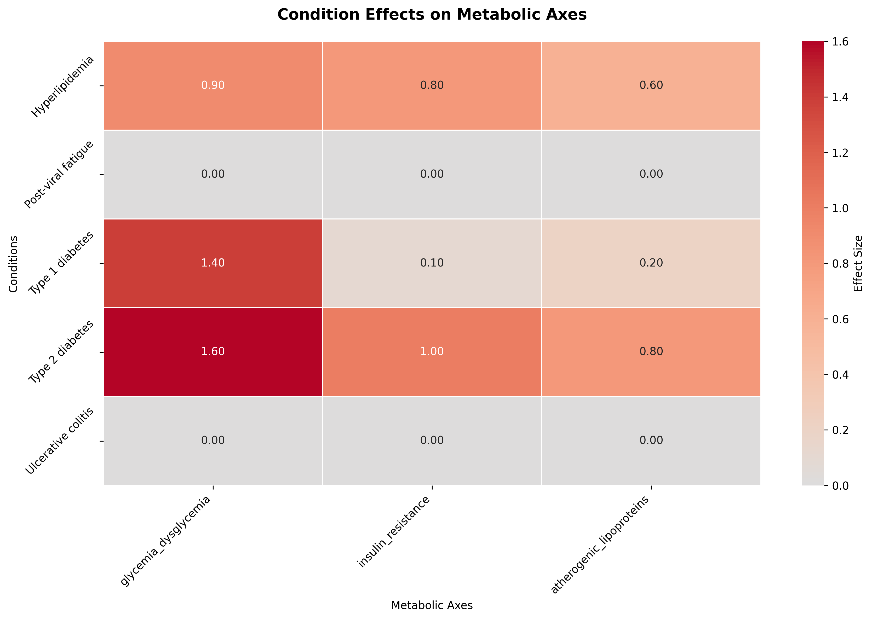
A higher condition-to-axis effect (E(axis, condition_i)) means the condition exerts a stronger pull on the corresponding latent axis, magnifying its role in the overall physiological profile. For example, a subset of the condition-to-axis effects matrix below shows that Type 2 Diabetes exerts a strong positive effect on the insulin_resistance axis, reflecting impaired insulin sensitivity, whereas Type 1 Diabetes has a smaller or even neutral influence since its pathology stems from insulin deficiency rather than resistance.

Intake-to-axis effects
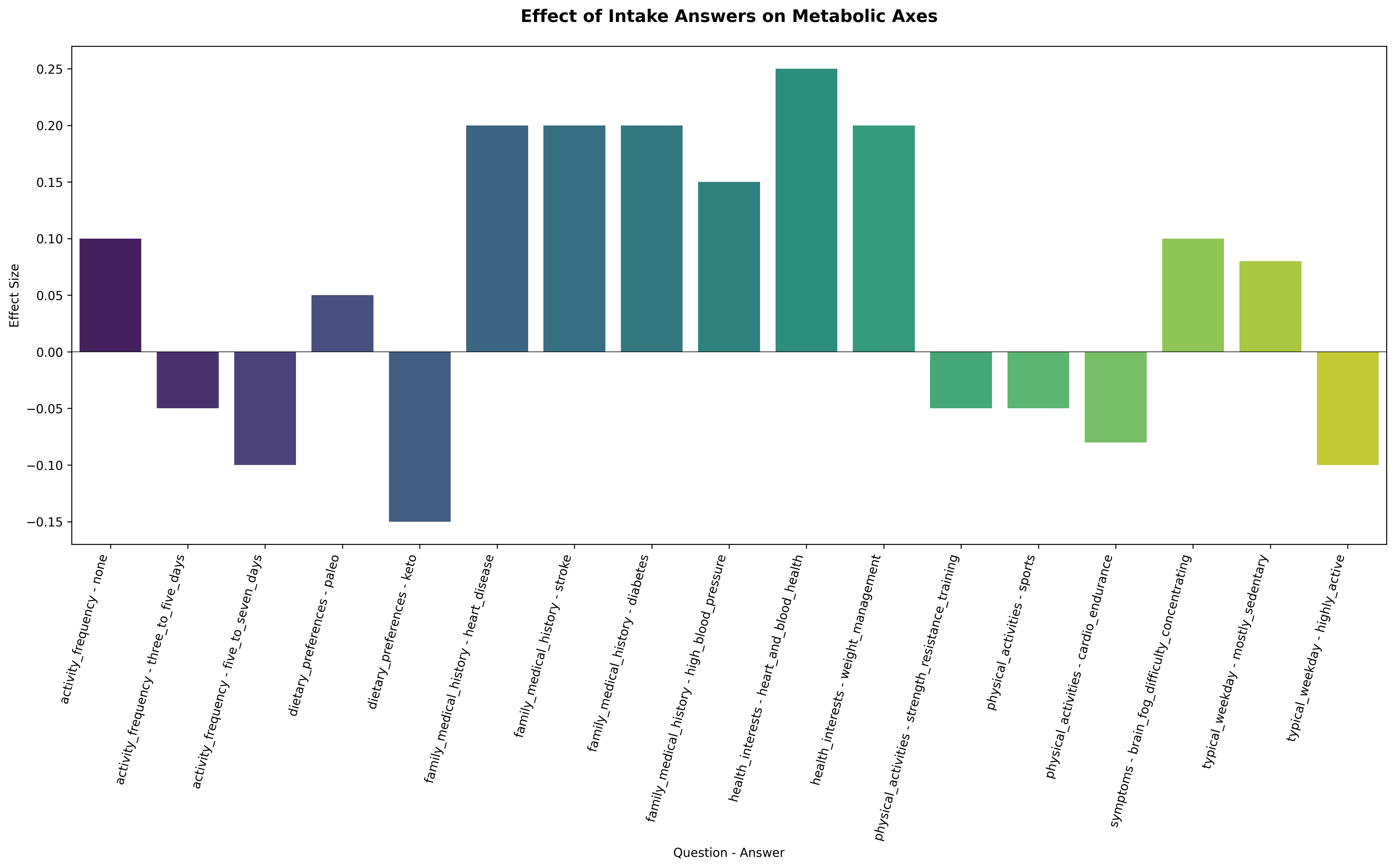
A higher intake-to-axis effect (I(axis, question_j, answer_j)) means that a given lifestyle choice or intake answer has a stronger influence on the corresponding latent axis, shifting that system in a favorable or unfavorable direction. For example, within the glycemia_dysglycemia axis, the effect associated with “Activity = None” is strongly positive, indicating higher dysglycemic pressure, while “Activity = 3–5 days/week” and “Activity = 5–7 days/week” exert progressively more negative effects, reflecting improved insulin sensitivity and better glycemic control through regular exercise, as shown below.

Axes to biomarker latent value generator
Each biomarker listens to 1–3 axes via loadings. Correlations between labs emerge naturally because shared axes drive them (not hand-coded pairwise links). When an axis improves (e.g., after lifestyle change), a cluster of related labs drifts together rather than moving in isolation. The latent biomarker values is computed as follows:
1η_biomarker = Σ_n [ loading_n × η_axis_n ] + ε_biomarker23where, η_biomarker is the latent value for the biomarker computed using η_axis scores and marker loadings for 'n' axes
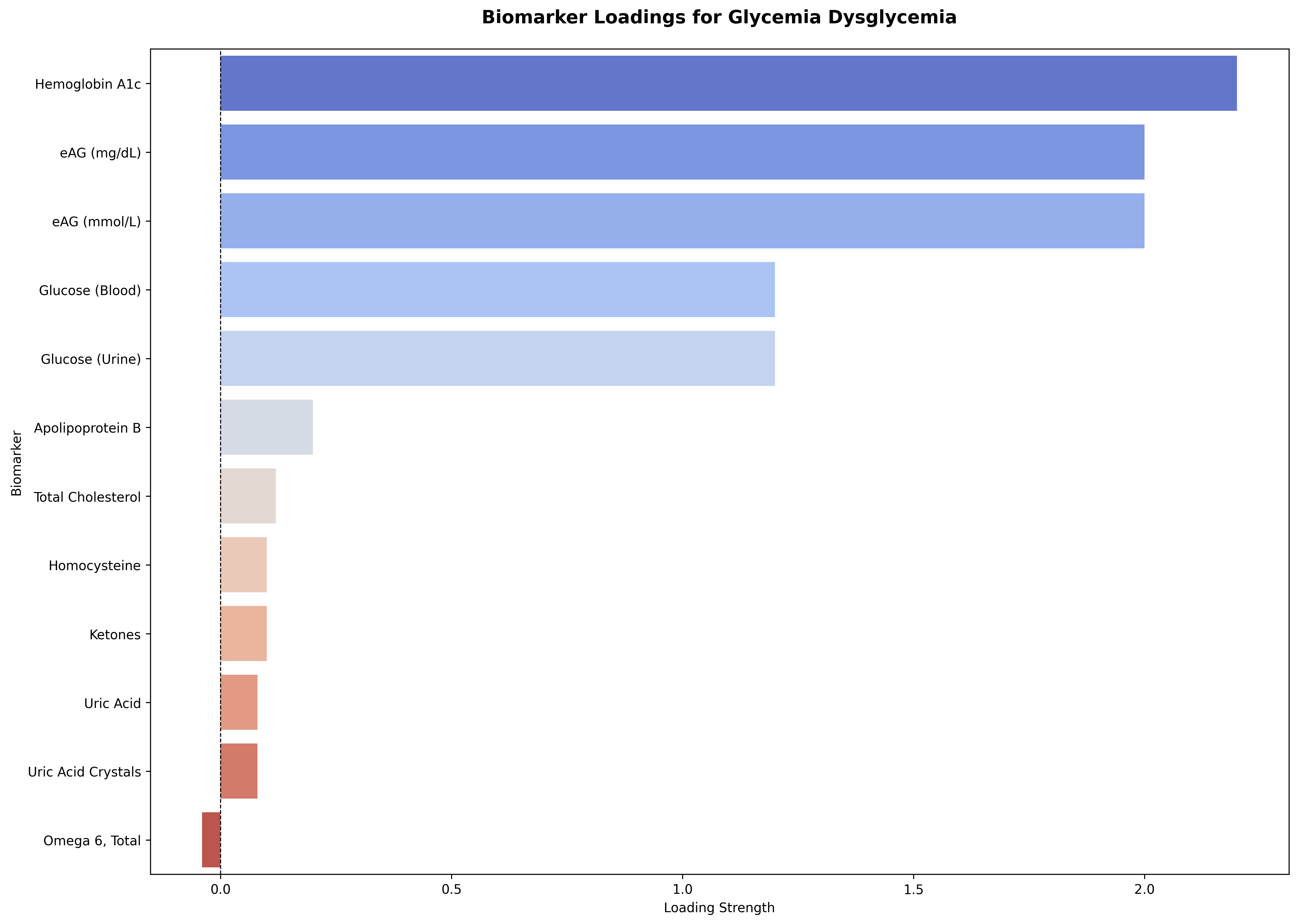
A higher biomarker loading (L(axis, biomarker_b)) indicates that the biomarker’s value more strongly reflects the state of that underlying physiological axis. For the glycemia_dysglycemia axis, as shown below, markers like Hemoglobin A1c and blood glucose show the strongest positive loadings. These biomarkers move tightly with glycemic dysregulation—when the axis rises (indicating poorer glycemic control), these values rise in tandem.
Conversely, markers like ketones, uric acid, uric acid crystals, and omega-6 fatty acids display weak or slightly negative loadings, representing secondary or inverse relationships to dysglycemia. Together, this loading profile ensures that the glycemia axis drives a realistic cluster of correlated biomarkers—from primary glucose indicators to related lipid and oxidative stress signals—so that simulated lab panels behave like real-world metabolic profiles.

Biomarker state converter
Continuous latent biomarker values convert to interpretable functional states using five symmetric bins shown below. These are more robust to small latent fluctuations and don't flip unnecessarily.
1Low if η < -2.02Suboptimal low if -2.0 ≤ η < -1.153Optimal if -1.15 ≤ η < 1.154Suboptimal high if 1.15 ≤ η < 2.05High if η ≥ 2.0
Numerical and categorical calibration (sex/age ranges that look real)
To produce categorical and numerical values with units, the generator looks up production ranges conditioned on sex and age band for the chosen state. Within the band, values are sampled with a center bias and a mild age adjustment (optional), then clamped to plausible limits. Because ranges are per-state and per-demographic, changing sex or age can change the final number even when η is the same.
1(range_min, range_max) ← Range_{biomarker, sex, age, state}23range_center = (min + max)/24center_adjusted ~ N(range_center, (range_width × 0.1))5value_raw ~ N(center_adjusted, (range_width × 0.2))67age_factor = 1.0 + (age - 40) × 0.002 [OPTIONAL]8value_final = clip( value_raw × age_factor, min, max )
Example
A 52-year-old man with type 2 diabetes (moderate) has a below-average H and intake answers that include low daily activity. The metabolic axis aggregates: a positive contribution from H, a positive type 2 diabetes push (scaled by severity) and lifestyle pushes in the same direction, plus noise—yielding a modestly elevated metabolic tone.
Glucose, which listens primarily to metabolic (with smaller inflammatory inputs), gets a positive latent value that may get binned into a "High" state. The numeric glucose is then sampled within the sex/age High range, nudged toward center, age-adjusted slightly, and clamped. If this patient enters a lifestyle-intervention trajectory, the metabolic axis slides downward over the next timepoints, and glucose and triglycerides drift together. The next section describes the longitudinal data generator needed to simulate such scenarios.
Longitudinal Data Generator
Time series extend the same architecture. Instead of redrawing from scratch at each timepoint, axes evolve through phases—improving, declining, stable, or volatile—according to a trajectory scenario implied by conditions and the global scenario:
1η_t = η_{t-1} × (correlation_decay)^Δt + drift_rate × Δt + ε_t2ε_t ~ N(0, (noise_scale^2) × Δt)
Correlation Decay — Memory of the System
The correlation_decay term controls how tightly each new point stays tethered to its previous state.
- Values close to 1.0 produce smooth, slow-moving series where the axis remembers its past strongly (common for physiological systems).
- Lower values (e.g., 0.6–0.8) allow faster reversion or more volatility, mimicking processes that fluctuate day-to-day.
- Operationally, the factor (correlation_decay)^Δt ensures that the correlation naturally weakens as the time gap between samples (Δt) increases.
Drift Rate — Systematic Direction of Change
The drift_rate defines the underlying trend of the axis:
- Positive drift = improving or compensating system (e.g., glucose decreasing during treatment).
- Negative drift = worsening system (e.g., inflammatory burden rising during flare).
- Zero drift = stable baseline.
This term encodes the phase behavior—whether the axis is in an improving, declining, or stable trajectory within its assigned scenario.
Noise Term — Day-to-Day Variation
The random shock εtε_tεt injects small, normally distributed deviations.
- Its variance scales with both the axis’s noise_scale (a property of the physiological system) and the elapsed time (Δt).
- This ensures that shorter intervals produce small jitter, while longer gaps can accumulate more drift and scatter—just like in real longitudinal lab data.
Putting It Together — Temporal Coherence
Each new axis value is a blend of memory, trend, and randomness:
- The correlation term anchors the new point to the last known state.
- The drift term moves the axis toward its phase target (improving, worsening, stable, or volatile).
- The noise term keeps trajectories organic and prevents them from looking algorithmically perfect.
This recursive structure makes each axis behave like a mean-reverting stochastic process with optional drift—similar to a damped random walk—while maintaining physiologic realism across time.
Downstream Effects
Because biomarkers are functions of these axes, their numeric values inherit the same time-series dynamics. That means interventions (e.g., improved lifestyle, therapy response) show coordinated multi-marker changes rather than independent noise, creating plausible longitudinal plots with realistic lag and correlation patterns.
Example: Biomarker Trajectories Over Time
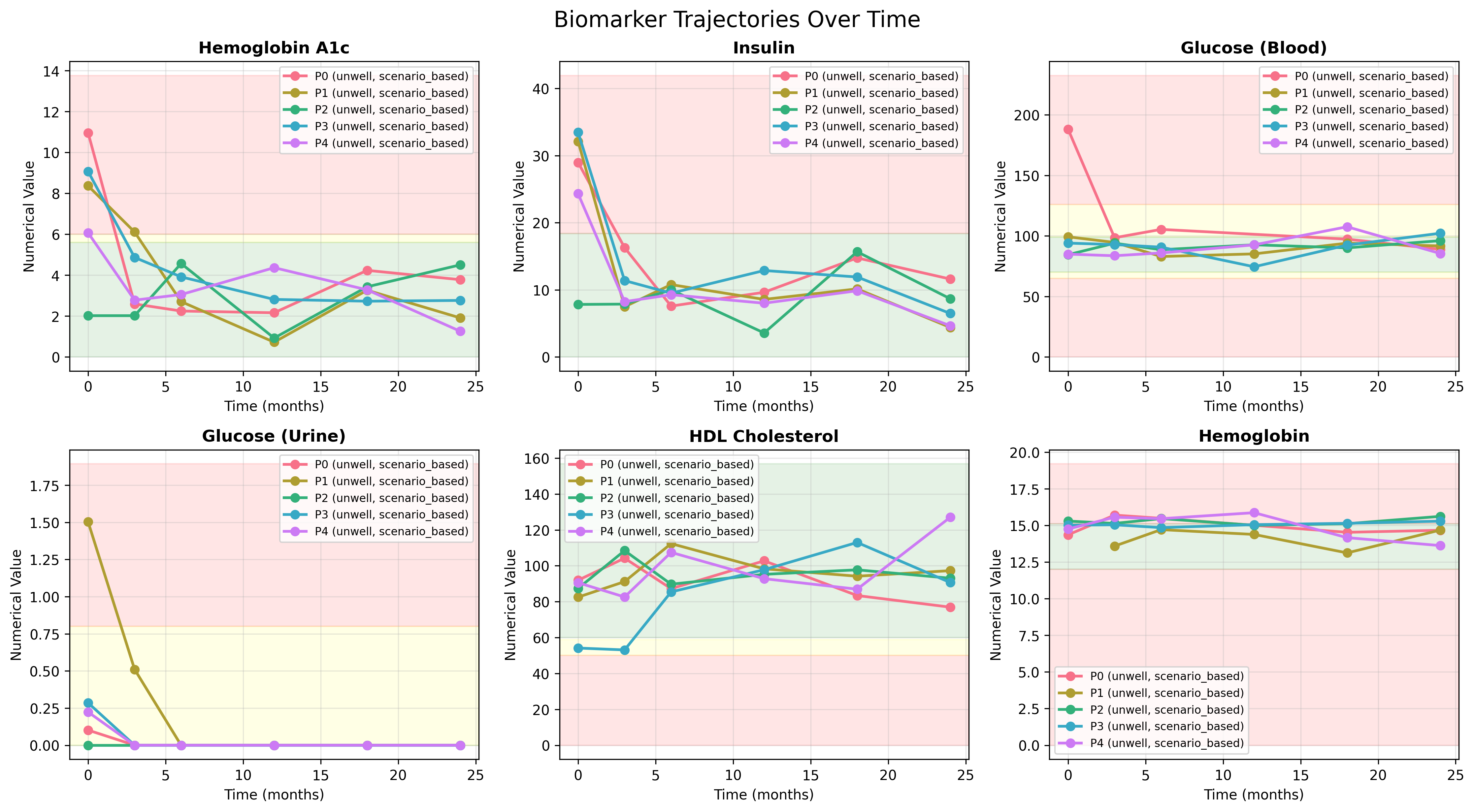
The plots below illustrate how biomarker values evolve when driven by the same latent-axis dynamics across multiple unwell patients under scenario-based trajectories. Each curve represents a simulated patient’s response over a 24-month period.
- Hemoglobin A1c, Insulin, Urine Glucose and Blood Glucose show coordinated early declines followed by stabilization, reflecting an improving metabolic phase consistent with treatment response or lifestyle intervention.
- HDL Cholesterol rises gradually, showing the expected inverse relationship with metabolic stress and improved glycemic control.
- Hemoglobin remains largely stable, confirming that unrelated markers maintain independent yet physiologically plausible variability.
Together, these trajectories demonstrate the generator’s ability to produce coherent longitudinal patterns—axes govern directional change, correlation decay smooths transitions, and noise introduces realistic variation between individuals.

Conclusion
The synthetic data generator can simulate various scenarios by turning a few knobs:
- Healthiness mix (baseline population wellness)
- Condition weights and condition_count_lambda (multimorbidity)
- Global lifestyle scale (how strongly intake affects biology)
- Axis biases (tilt whole systems up/down)
- Biomarker loadings (which axes each lab “hears”)
- Noise scales and correlation_decay (texture of time series)
- Missingness patterns for intake and labs
These let you craft cohorts that resemble: a general population, a metabolic clinic, a post-treatment recovery study, or a wellness program emphasizing lifestyle change. This bridges realism and control—producing datasets that behave like real populations while remaining fully configurable and privacy-safe. By grounding every layer in shared physiological axes, it ensures internal coherence across demographics, conditions, lifestyle inputs, and lab values. Whether you need a static cohort or a multi-year time series, the system delivers believable trajectories and correlations that stand up under analysis. It’s a framework built not just to mimic biology, but to make experimentation, modeling, and visualization faster, safer, and more reproducible.
Share this post
Related Posts

Building Flurry: How We Used Agents to Democratize Data Access at Fullscript
Flurry lets anyone ask data questions in plain English and get trusted insights instantly. Learn how we built it at Fullscript.

Developing a Modern Search Stack: Personalization, Making Search Results Feel Less Generic
we described how we added a vector model to our search stack, which gave us the power of hybrid search - balancing lexical and semantic matching